for this blog, i want to compare different types of photography. in particular, i want to compare and contrast black and white to color photography.
in Alber's book, the interaction of colors, he stated that color photography deviates still more from eye vision than black and white photography. blue and red are overemphasized to such an extent that their brightness is exaggerated.though this may flatter public taste, the result is a loss in finer nuances and in delicate relationships. white rarely appear white but usually look greenish.
more commonly we see color photography than black and white today. there are options in our cameras or our cell phones where we can change the setting to black and white and enjoy the antique feeling of the photography, but typically, color photo is the way to go for just about anything.
as Albers states, color photography deviates from the eyes more than black and white. it captures the image the way it exactly the way it is, which gives the viewers a sense of feeling as if they were at the setting where the photography was taken. Color does transform a single design. it gives a sense of realism, attracts our eyes, and allows for the viewers to analyze and have a sense of expectation of the meaning that the photographer is trying to send to the viewers.
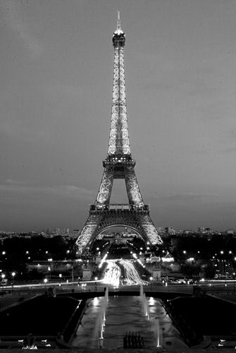
the picture above of eiffle tower is in black and white and portrays different shadows from light to dark. it is clear to see the lighting in the tower and know what to expect, but its also dull in our eyes as well.
here is a color version of eifffle tower. with the same setting and same angle, our eye is automatically attracted to the tower with the dark background contributing to our eyes.
without color, the feeling and the meaning of the picture can be lost.


No comments:
Post a Comment